Anyone who thinks this is an acceptable error message should be banned from app design until they feel thoroughly ashamed of themselves.
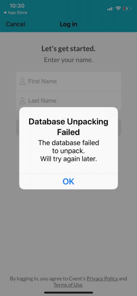
Anyone who thinks this is an acceptable error message should be banned from app design until they feel thoroughly ashamed of themselves.
I thought that GDPR was meant to make clumsy opt-ins like this a thing of the past.
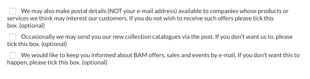
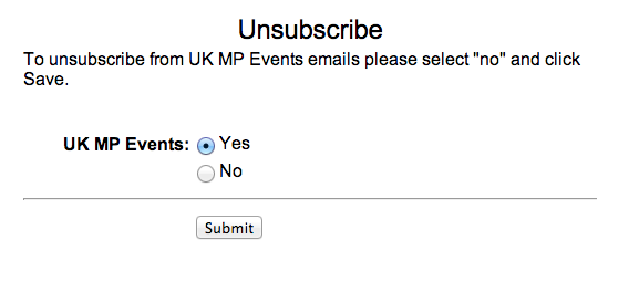
The design pattern, “tick here to opt out” should be banished to the waste bin of history.
Someone designed this.
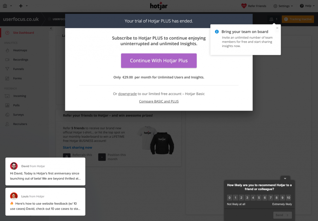
I signed into Hotjar yesterday for the first time for many moons.
This was what greeted me.
Who decided that the user needs this many pop-ups when they sign in?
Update: I got a nice response from the developers:
I can’t work out if this is a dark pattern or if it’s just extremely lazy copywriting.
I certainly had to think for a moment.
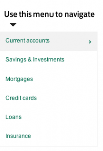
Are Lloyds Bank customers somewhat dimmer than the rest of the world, we wonder? In the ‘Products Explained’ part of their web site they have a left-hand menu with help text that reads: ‘Use this menu to navigate’.
Here’s the menu in context (click for a larger view):
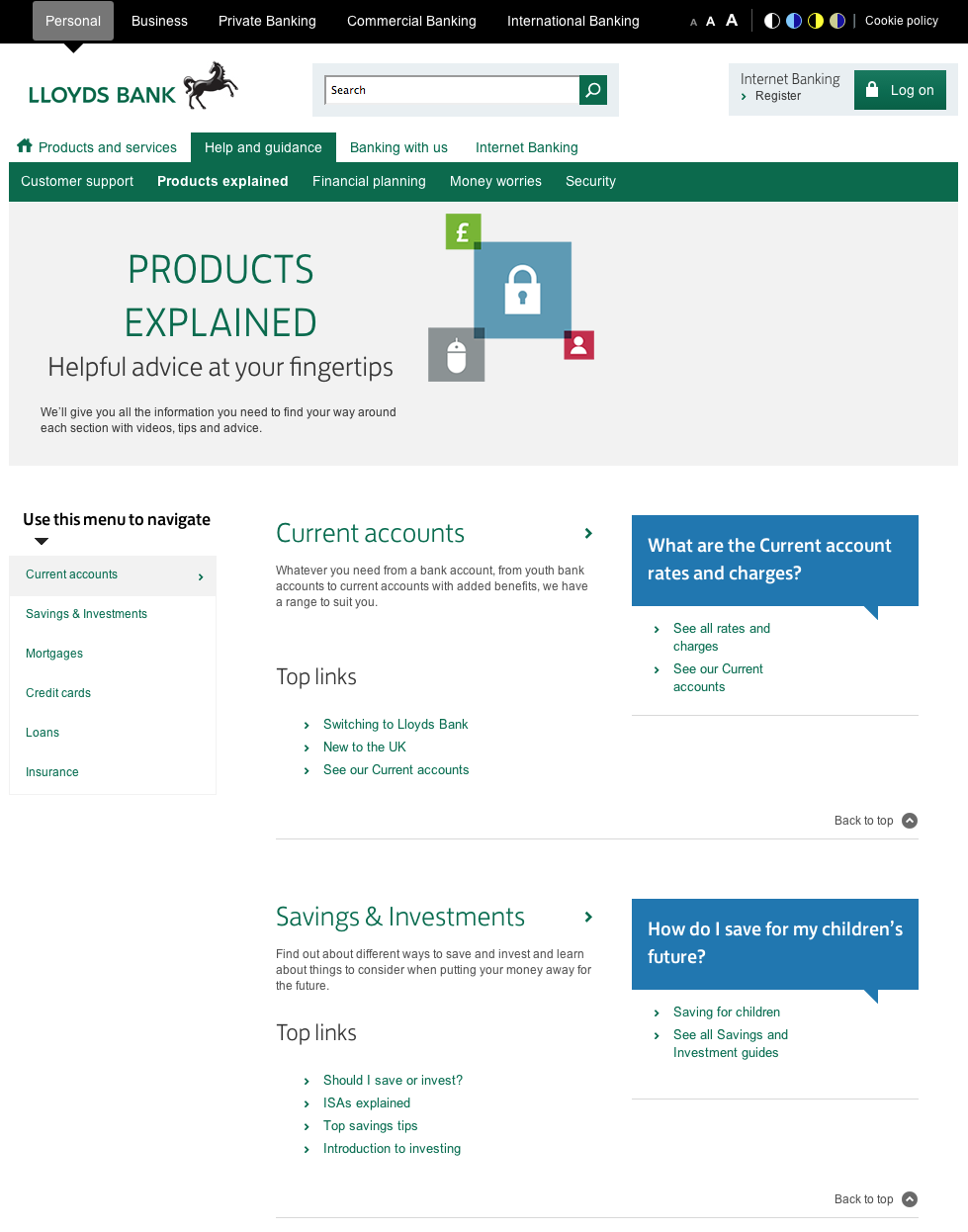
This is one of those ‘features’ that sometimes appears in a redesign after a usability test. ‘No-one used the left hand menu,’ reports the usability analyst, ‘probably because people’s eyes are drawn to the colours and links in the centre of the page’.
‘I know,’ thinks someone from marketing, ‘Let’s do something to draw people’s attention to the menu’.
The problem is that the more you ‘draw people’s attention’ to parts of the page, the less usable the whole page becomes.
Thanks to John Rieger for telling me about this.
Note added
After posting this, @NeilDavidson pointed out that this design pattern has provenance:
I got this email today from a company asking me to complete a survey.
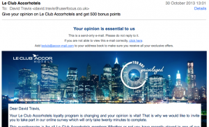
I thought that there was an interesting juxtaposition at the top of the email.
I noticed that my opinion wasn’t just important to them: it was essential.
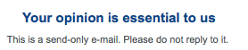
And then, just below this message, I noticed: “This is a send-only e-mail. Please do not reply to it.”
So my opinion is essential, but only if it’s given in the right format.
I’m not sure when no-reply emails became fashionable, but in my view, using them is the antithesis of being customer centred. What a ‘no-reply’ email address says is: “Our time is much more important than yours. If you want to contact us, you’ll need to wade through our convoluted online form, specifically designed to keep customers like you at arm’s length.”
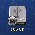
(a) The disk 500GB is nearly full.
(b) The disk 500GB is about to fail.
(c) The disk 500GB is running at turbo speed.
When I polled a group of people on Twitter, the correct answer (c) was chosen by about a third of people. Most people picked (b): “It looks like it’s about to blow, Captain!”
The icon appears when you install Western Digital’s drivers. It’s meant to show that the disk is in turbo (high speed) mode. But there’s something not right about that needle pointing to the red zone…

I think these two photos tell you all you need to know about design leadership.
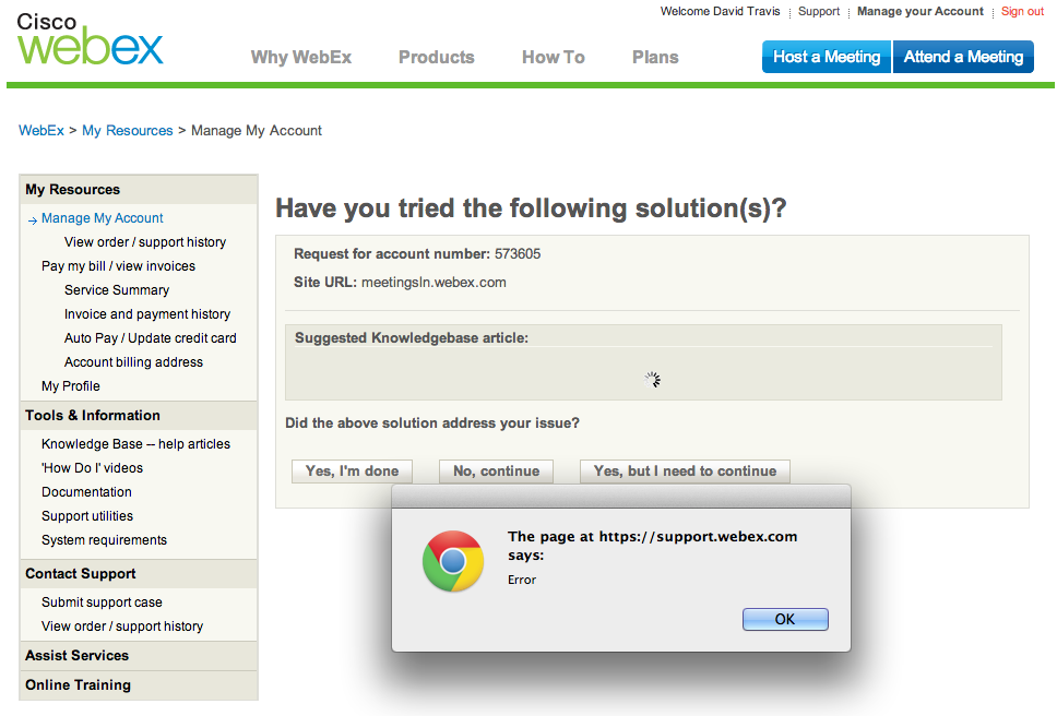
Webex.
Whenever I use Webex I struggle. Error handling like this doesn’t help much. (Click the image for a larger view).