I was reading about a book on Amazon today when I came across this:
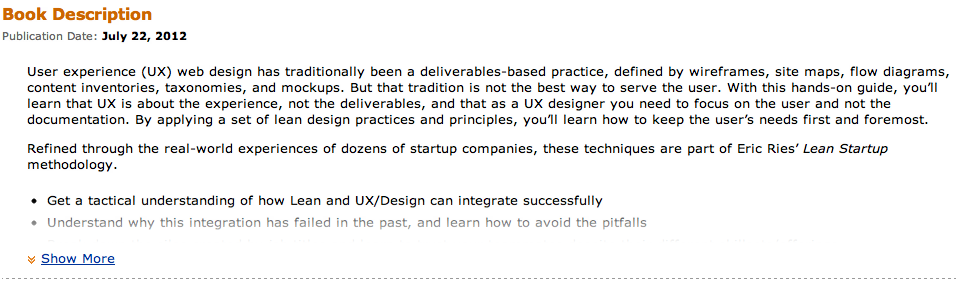
Take a look at that last bullet.
The designers have greyed it out to indicate that there’s more content available.
Now I know that the ‘Show More’ link should be sufficient, but frankly if that second bullet had been in the same black colour as the first one, I’m sure I would have missed it. After all, there are quite a few links on Amazon product pages and this one runs the risk of disappearing into the noise.
This is similar to the problem Jared Spool describes as ‘scroll stoppers’: a design element (like a horizontal rule) that makes you think the page has loaded all of the content when in fact there’s more to be seen below the fold.
I think that the Amazon designers have done a clever job in creating a design pattern that avoids this effect. I wonder if a browser vendor will implement the same kind of pattern at the bottom of a browser page to indicate that it has more content?