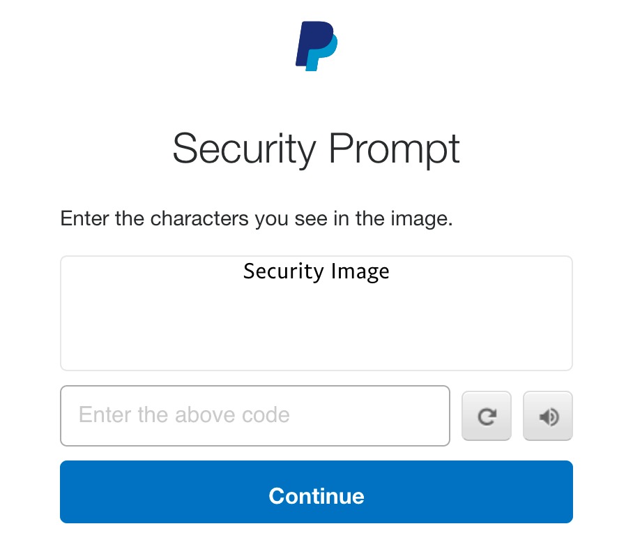
This isn’t what you want to see on a financial web site when you’re in the middle of a money transfer. On the plus side, it’s good to see their designers use alt text.
This isn’t what you want to see on a financial web site when you’re in the middle of a money transfer. On the plus side, it’s good to see their designers use alt text.
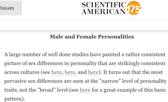
The editor at Scientific American clearly didn’t get the memo that links need to make sense out of context.
“Click here” links cause problems for people using screen readers. Screen readers allow users to navigate the page quickly by only reading out the links. When the screen readers says, “Here”, “Here”, “Here”, and “Here” you’ve no idea where the links will take you.
Though less serious, it’s also a readability issue for sighted readers. You have to go back and scan the text to check where this link will take you.
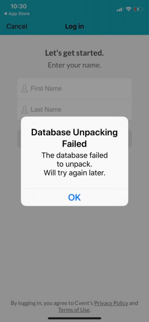
Anyone who thinks this is an acceptable error message should be banned from app design until they feel thoroughly ashamed of themselves.
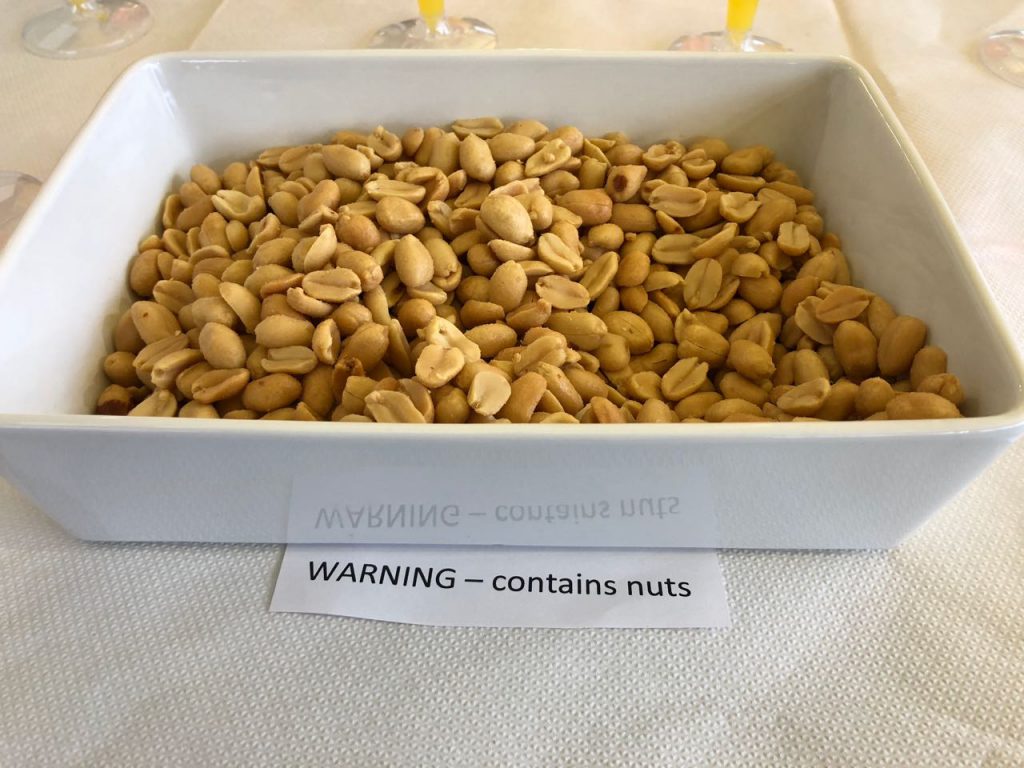
Presumably this sign is for people who can’t see but can still read.
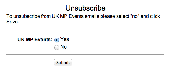
I thought that GDPR was meant to make clumsy opt-ins like this a thing of the past.
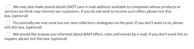
The design pattern, “tick here to opt out” should be banished to the waste bin of history.
Someone designed this.
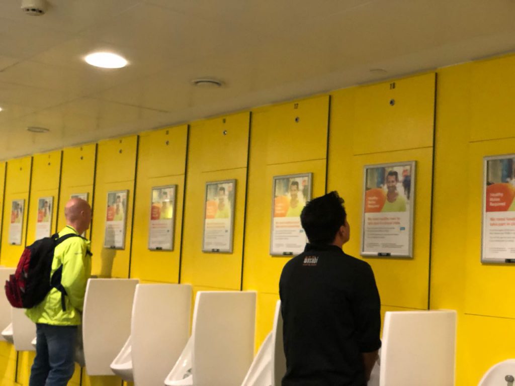
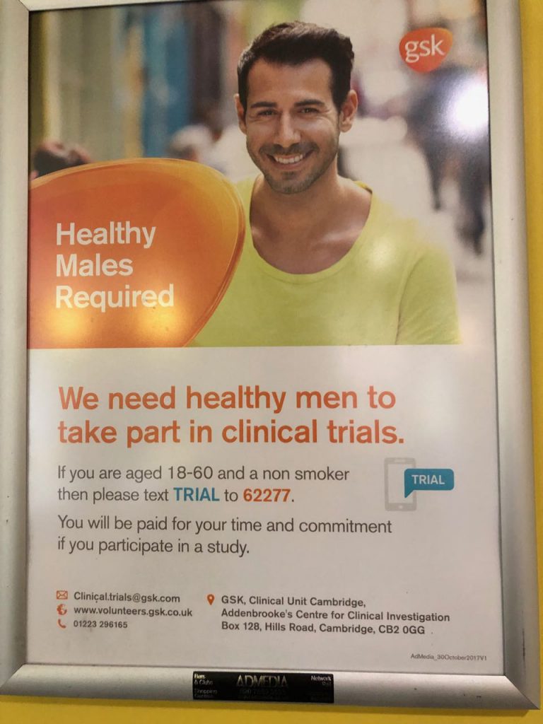
I thought this was an imaginative way to recruit people for research sessions.
I signed into Hotjar yesterday for the first time for many moons.
This was what greeted me.
Who decided that the user needs this many pop-ups when they sign in?
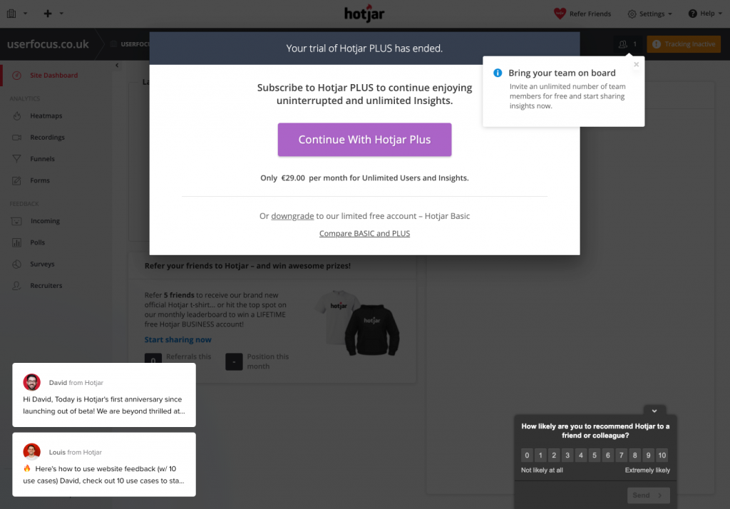
Update: I got a nice response from the developers:
I can’t work out if this is a dark pattern or if it’s just extremely lazy copywriting.
I certainly had to think for a moment.
Are Lloyds Bank customers somewhat dimmer than the rest of the world, we wonder? In the ‘Products Explained’ part of their web site they have a left-hand menu with help text that reads: ‘Use this menu to navigate’.
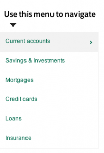
Here’s the menu in context (click for a larger view):
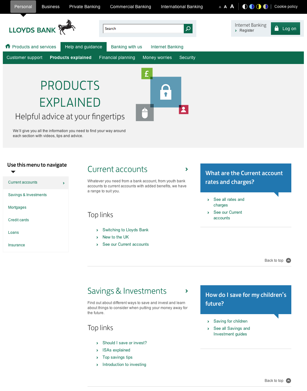
This is one of those ‘features’ that sometimes appears in a redesign after a usability test. ‘No-one used the left hand menu,’ reports the usability analyst, ‘probably because people’s eyes are drawn to the colours and links in the centre of the page’.
‘I know,’ thinks someone from marketing, ‘Let’s do something to draw people’s attention to the menu’.
The problem is that the more you ‘draw people’s attention’ to parts of the page, the less usable the whole page becomes.
Thanks to John Rieger for telling me about this.
Note added
After posting this, @NeilDavidson pointed out that this design pattern has provenance: