Are Lloyds Bank customers somewhat dimmer than the rest of the world, we wonder? In the ‘Products Explained’ part of their web site they have a left-hand menu with help text that reads: ‘Use this menu to navigate’.
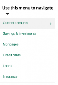
Here’s the menu in context (click for a larger view):
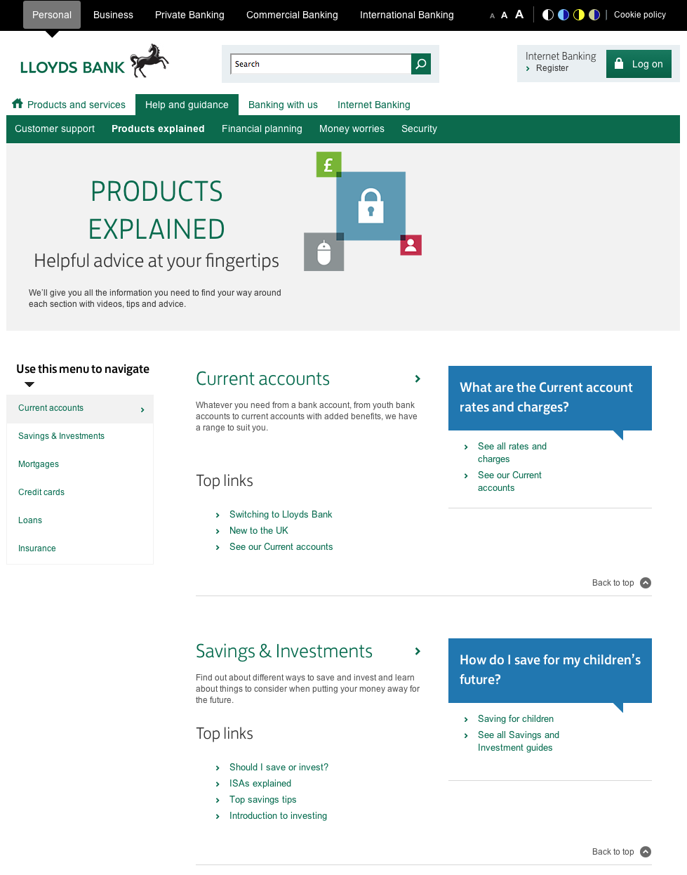
This is one of those ‘features’ that sometimes appears in a redesign after a usability test. ‘No-one used the left hand menu,’ reports the usability analyst, ‘probably because people’s eyes are drawn to the colours and links in the centre of the page’.
‘I know,’ thinks someone from marketing, ‘Let’s do something to draw people’s attention to the menu’.
The problem is that the more you ‘draw people’s attention’ to parts of the page, the less usable the whole page becomes.
Thanks to John Rieger for telling me about this.
Note added
After posting this, @NeilDavidson pointed out that this design pattern has provenance: