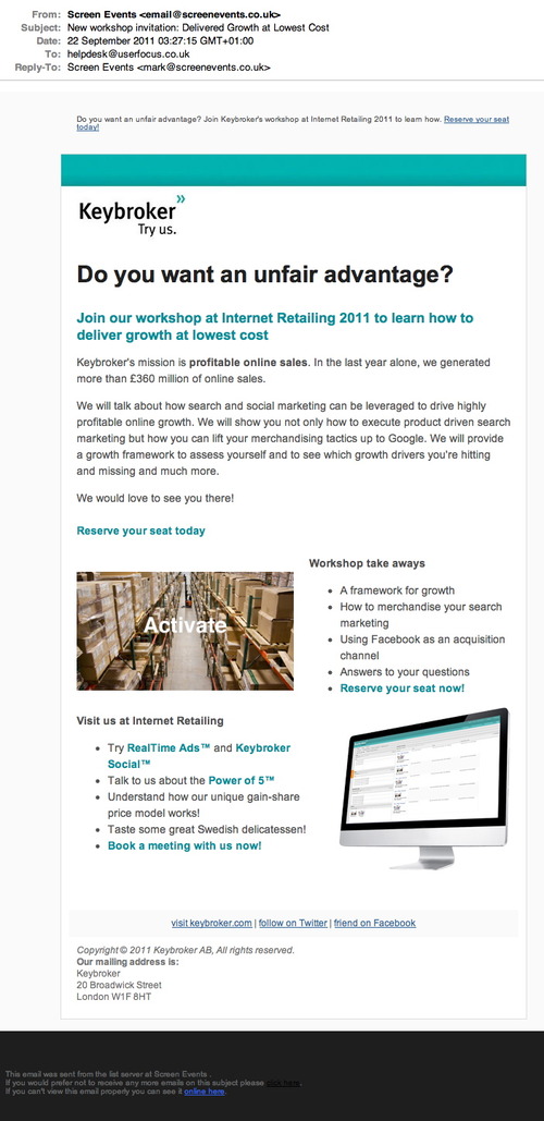
I get lots of spam mail. I’m sure you do too. Lately, I’ve found myself looking for the ‘unsubscribe’ link in the emails that I’m sent.
I received this today. Where would you click if you wanted to unsubscribe?
If you check the footer, you’ll see that the unsubscribe link is written in black. Yes, a black link on a black background.
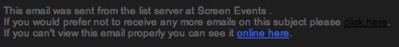
I truly hope there is a special place in hell for designers who do this kind of thing.
This will have been done because the likes of Mailchimp and Campaign Monitor require you to have such a link in your email to allow it to be sent. I’m surprised to be honest they didn’t just make the whole line the same colour and be done with it as it doesn’t make sense without the last word really :)Agreed though that they should have their own special place in hell; a really terrible practice…