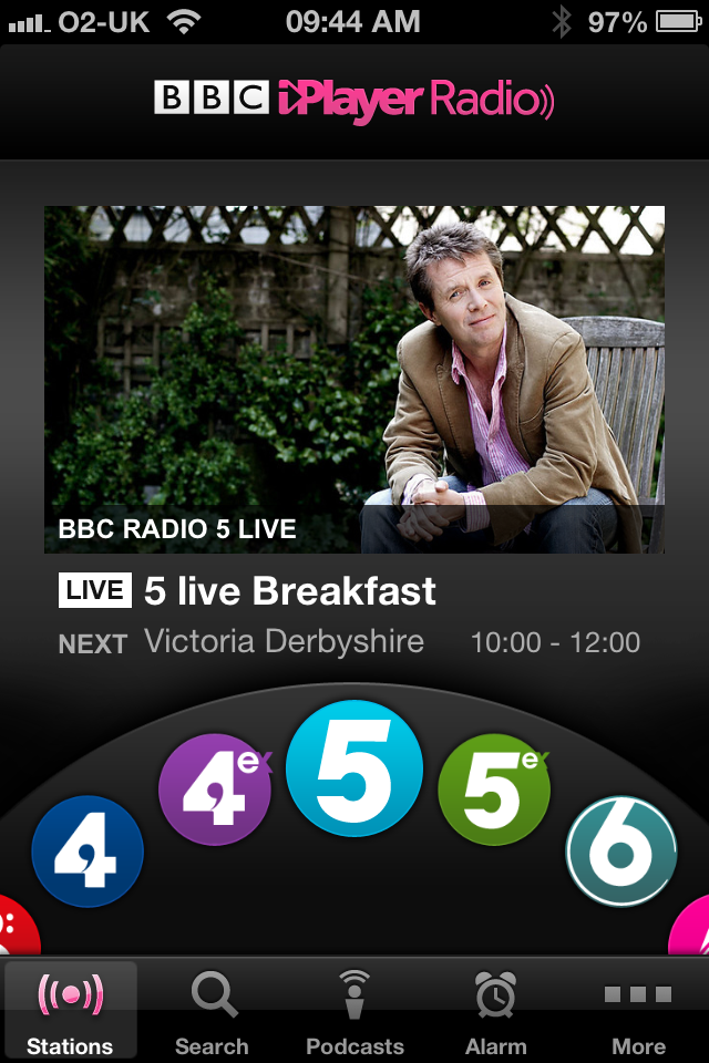
The BBC’s new iPlayer Radio app has a carousel at the bottom of the screen that you can use to scroll through the various channels.
At first when I saw it I thought it was a bit skeuomorphic: I thought the design team were trying to replicate a circular tuning dial that you might find on a physical device.
But when you use it, you realise it’s actually a very clever design. This is because, when you’re using it with one hand, your thumb moves in an arc. This makes the interaction very natural — even ‘ergonomic’.
Like most of what the BBC do, the whole app is very well thought through. I love the way that a publicly-owned organisation like the BBC is showing its richer competitors how to do user experience design.
