What does a ‘no-reply’ email address say about you?

I got this email today from a company asking me to complete a survey.

MailScreenSnapz002

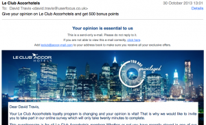
I thought that there was an interesting juxtaposition at the top of the email.

MailScreenSnapz003

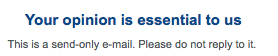
I noticed that my opinion wasn’t just important to them: it was essential.

And then, just below this message, I noticed: “This is a send-only e-mail. Please do not reply to it.”

So my opinion is essential, but only if it’s given in the right format.

I’m not sure when no-reply emails became fashionable, but in my view, using them is the antithesis of being customer centred. What a ‘no-reply’ email address says is: “Our time is much more important than yours. If you want to contact us, you’ll need to wade through our convoluted online form, specifically designed to keep customers like you at arm’s length.”


What does this icon mean?

FinderScreenSnapz001

(a) The disk 500GB is nearly full.

(b) The disk 500GB is about to fail.

(c) The disk 500GB is running at turbo speed.

When I polled a group of people on Twitter, the correct answer (c) was chosen by about a third of people. Most people picked (b): “It looks like it’s about to blow, Captain!”

The icon appears when you install Western Digital’s drivers. It’s meant to show that the disk is in turbo (high speed) mode. But there’s something not right about that needle pointing to the red zone…

How real users view your web site

I’m running some remote usability tests this week where I ask participants to share their desktop with me. I’m viewing the tests on a 30″ Apple Cinema Display and it’s easy to forget the lower-spec hardware that many users still struggle with day-to-day. Here’s a screenshot from one participant: you’ll notice:

  • Users install lots of crap in their browser (either deliberately or inadvertantly).
  • The browser chrome and toolbars take up over a third of the display.
  • When viewing the results of a Google search, just one natural search result appears above the fold.

I’m not saying that this configuration is typcial, but it’s certainly not unusual to find this when you look at the way “real” users use the web, rather than the digerati.

Snapz_pro_xscreensnapz002

No wonder Groupon are going out of business

I read that Groupon are struggling at the moment. I thought I’d visit their site and have a cursory look at the user experience.

It turns out that they won’t even let you use the site without signing up — or at least, they hide the close box behind the pop-up so well that it may as well be registration only.

This kind of design mistake went out in the mid-90s. 

They could also do with some help with their geolocation algorithm. They think I’m in Belfast. In fact, I’m currently in Stamford, CT. 

Pic001

The BBC show how to design an iPhone carousel

Iphone_14

The BBC’s new iPlayer Radio app has a carousel at the bottom of the screen that you can use to scroll through the various channels.

At first when I saw it I thought it was a bit skeuomorphic: I thought the design team were trying to replicate a circular tuning dial that you might find on a physical device.

But when you use it, you realise it’s actually a very clever design. This is because, when you’re using it with one hand, your thumb moves in an arc. This makes the interaction very natural — even ‘ergonomic’.

Like most of what the BBC do, the whole app is very well thought through. I love the way that a publicly-owned organisation like the BBC is showing its richer competitors how to do user experience design.

Must try harder

I saw these two juxtaposed tweets in my Twitter stream today. These kinds of issues are par for the course with new software, but in an old timer like Office it’s very hard to excuse.

Snapz_pro_xscreensnapz001

A design pattern to avoid scroll stoppers

I was reading about a book on Amazon today when I came across this:

Snapz_pro_xscreensnapz001

Take a look at that last bullet.

The designers have greyed it out to indicate that there’s more content available. 

Now I know that the ‘Show More’ link should be sufficient, but frankly if that second bullet had been in the same black colour as the first one, I’m sure I would have missed it. After all, there are quite a few links on Amazon product pages and this one runs the risk of disappearing into the noise.

This is similar to the problem Jared Spool describes as ‘scroll stoppers’: a design element (like a horizontal rule) that makes you think the page has loaded all of the content when in fact there’s more to be seen below the fold. 

I think that the Amazon designers have done a clever job in creating a design pattern that avoids this effect. I wonder if a browser vendor will implement the same kind of pattern at the bottom of a browser page to indicate that it has more content?